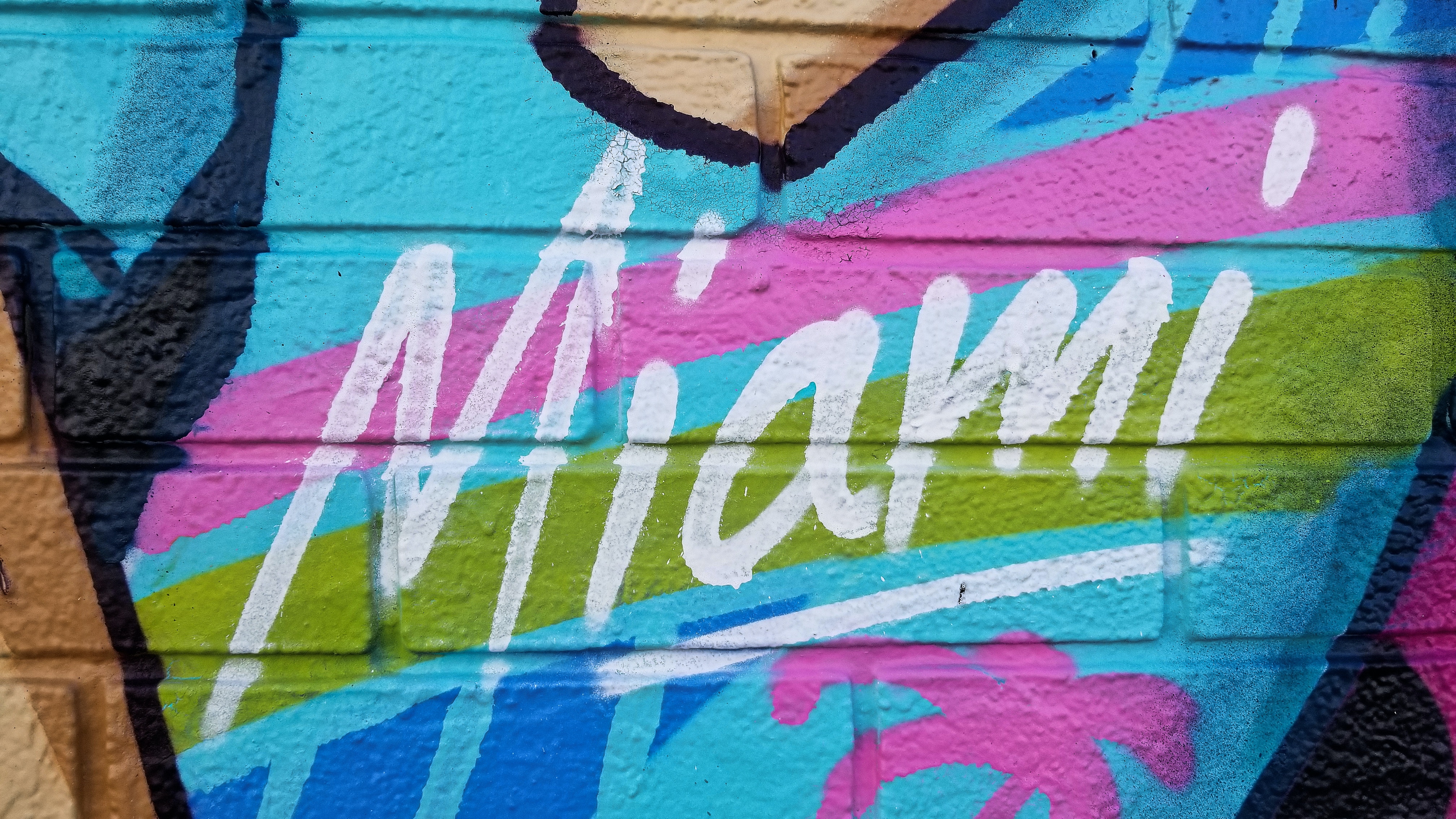
A Slice of Miami Vice: The Concept
In the "A Slice of Miami Vice" campaign for Warner Bros., I aimed to capture the essence of the iconic '80s series with a modern twist. The campaign was designed to evoke the neon-drenched aesthetic and the pulsating energy of Miami's nightlife. As a Product Designer, my role was to create an interface that would serve as a digital time machine, taking users back to the heart of the '80s with just a click, while ensuring a seamless and engaging user experience.
Visual and Interactive Elements
The visual elements were a crucial aspect of the campaign. I incorporated the quintessential pastel color palette and vintage typography that are synonymous with "Miami Vice." Interactive elements were designed to be playful and immersive, with nods to the era's style and technology. Users could navigate through a virtual Miami, encountering hidden easter eggs and exclusive content, all while an '80s-inspired soundtrack played in the background, setting the mood for exploration and nostalgia.
The User Journey
The user journey was meticulously crafted to mirror the narrative arcs of the show—full of intrigue and excitement. Each section of the campaign was an episode, leading users through story-driven interactions. The goal was to not just promote the "Miami Vice" series but to create an experience that was as captivating as the show itself. The campaign was a hit, resonating with fans and newcomers alike, and it stood as a testament to the enduring allure of the "Miami Vice" legacy.


